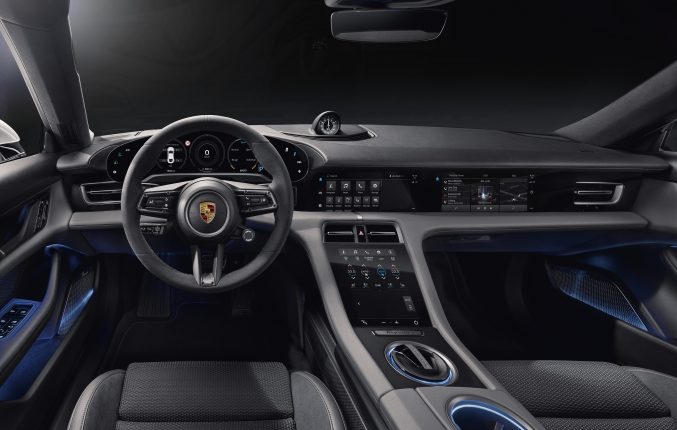
Porsche has released teaser images of the Taycan’s interior, and the reception from the electric vehicle community has been somewhat mixed. The cabin of the upcoming all-electric sports car is arguably the most forward-thinking among Porsche’s lineup. It is also not difficult to see that the German carmaker adopted a theme that is notably different compared to Tesla’s ubiquitous and minimalistic cabin, but that is a good thing.
When Porsche was designing the Taycan, the company was not designing a vehicle like the Model 3. Instead, the company was designing an electric Porsche. In this sense, a degree of familiarity is needed, especially considering that among the Taycan’s target demographic are people that have long embraced the company’s other vehicles, such as the iconic 911.
This is a notable point, considering that the community’s aversion to the Taycan’s dash layout seemed to be due to the number of buttons and icons across the vehicle’s multiple touchscreens. Some comments noted that the only difference between the controls of the Taycan and something more traditional like the Cayenne is that the buttons are now touch-based instead of mechanical.
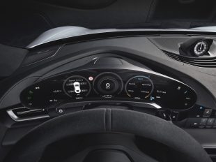
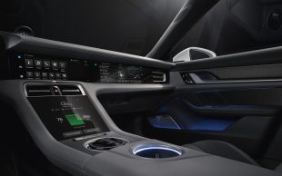
The Porsche Taycan is equipped with five touchscreens. Its instrument cluster, which has four Driving Modes, consists of a curved, rounded 16.8″ display with touch-enabled buttons on the sides. This is complemented by a central 10.9″ infotainment screen and a secondary display for the front passenger. An 8.4″ touch panel with haptic feedback stands as the Taycan’s fourth touchscreen, while a fifth, optional 5.9″ display is also available for rear-seat passengers to adjust climate control and other settings.
Porsche intends to adopt an aggressive rollout of electric and electrified vehicles in the near future, with the Taycan being the car to lead the charge. The Taycan must then strike a balance between traditional and progressive. Having a series of touch-based controls that are relatively similar to the controls the Porsche 911 and its other fleet of vehicles helps this case. Apart from this, the company has also highlighted that the Taycan’s touch displays are customizable, which means that drivers could adopt a more streamlined theme to their vehicles’ multiple touchscreens as needed. Having a fully digital display also gives Porsche the ability to gradually, and strategically, institute changes to its user interface design through software updates, and in a way that eases its audience into the age of modern user experiences.
But as it stands now, there is a certain degree of familiar ergonomics that is provided with the Taycan’s multiple touch displays. The optional touch panel on the passenger side, for one, allows passengers to navigate the vehicle’s functions without leaning over to the center console. The haptic feedback on the display at the center console is easily accessible from the passenger seat as well.
Ultimately, credit is due to Porsche for putting a notable amount of effort in developing a custom touch-based control system for the Taycan. It may not have the distinctly Silicon Valley-esque theme that is present in the Model 3, but the Taycan’s multiple digital touch-based controls show serious effort. It is, if any, notably better than the dual-screen infotainment system on the Audi e-tron, which appears to have been directly derived from an internal combustion vehicle.

<!–
–>


